Data Visualization
Idea.
Through Toronto's Open Data, I gained access to datasets released by the Toronto Police Services, such as Neighborhood Crime Rates and Police Facility Locations in both GeoJSON and CSV. I was then able to cross-reference the data with Microsoft Excel using their CSV files. I also created an interactive visual map using Mapbox Studio which helped me transform the GeoJSON files into Interactive visual mapping for the data. Adobe Illustrator was the last step to designing my infographic that was made to visualize some of the data I was able to draw from combining both data sets.


MapBox.
My MapBox visualization features the 2023 assault rates across Toronto neighborhoods. Blue is assigned to a neighborhood, Starting light (25 assaults being the lowest per neighborhood) and getting darker as the assault numbers rise (656 being the highest assault rate in a neighborhood). This data is cross-referenced with the locations of Toronto Police Facilities, which are shown by yellow points. This color-coded representation enhances the map's readability and provides a clear, visual distinction between the two types of data. Blue and Yellow were picked to still be visually distinctive to color blind individuals.
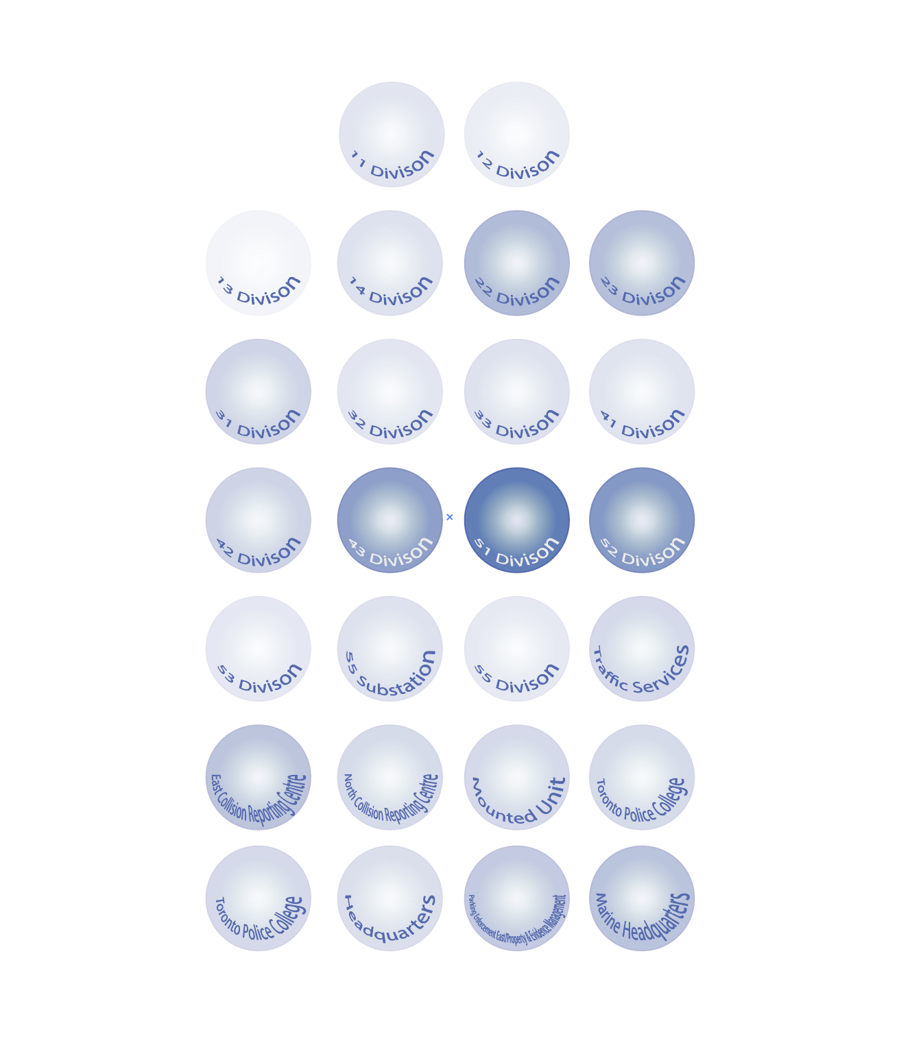
Infographic.
In my Adobe Illustrator infographic, I visualized each police facility with an oval of varying opacity based on neighborhood crime rates from 25 to 656. With this, we can get a visual impression of the possible correlations between the assault rate and police facilities in neighborhoods. Looking back at the MapBox visualization, It's evident there are several neighborhoods in a darker blue, indicating a higher rate of assault. However, looking at the Infographic which only presents the neighborhoods with police facilities, dark blue is evidently less prominent, with the exception of the 51 Division. This brings up a possible relationship between Police Facilities and Assault Rates; are police facilities strategically placed in less violent neighborhoods, or do neighborhoods with police facilities experience reduced violence?.

Statement.
In this project I used Toronto’s Open Data, analyzed the relationship between neighborhood assault rates and police facility locations The primary finding from the analysis suggested an uneven distribution of assault rates relative to police facilities, challenging assumptions about their strategic placement and effectiveness. To visualize these relationships, I employed Mapbox Studio to create an interactive map Additionally, I designed an infographic using Adobe Illustrator to succinctly present these findings. The choice of tools and design was driven by the aim to make the data very clear and simple, leading to an easier interpretation and wider understanding of the message I was trying to convey.
This research has many practical uses. It can help urban planners and local officials locate police facilities with these insights and possibly affect policy and how resources are allocated to improve public safety. For example, if police facilities were found to reduce crime, more police could be placed in areas with high crime rates. If no association is found, that might suggest the need for different crime reduction methods other than just putting police facilities.
Moreover, a project such as this engages the community in making the data legible to everybody. Residents could use such information to press for changes or improvements in their neighborhoods, using the actual data on crime rates and the effectiveness of police locations as support.
Finally, this research gives valuable information concerning crime and policing in Toronto. As such, it becomes a critical tool in making informed decisions about the safety of urban areas. This project helps break down data through easy-to-understand visuals that allow everyone, from government officials to members of local communities, to make choices for ways to make their areas safer.
CITATIONS:
Toronto Police Services. "Police Facility Locations." Toronto Police Services, 2023, https://www.toronto.ca/data/parks/live/dws_allupdates.json
Toronto Police Services. "Neighbourhood Crime Rates." Toronto Police Services, 2024, https://www.toronto.ca/data/parks/live/centres.json
Espiegle. (n.d.). Toronto skyline [Photograph]. Encyclopædia Britannica. Retrieved June 18, 2024, from https://www.britannica.com/place/Toronto#/media/1/599980/304316